
Mumbai’s one of the favourite art galleries, Jhaveri Contemporary, recently got a new brand identity by a team led by London-based designer Sthuthi Ramesh. The identity refresh comes at the ten-year anniversary for this gallery that has been exhibiting some of the best of contemporary art since its inception in 2010. Jhaveri Contemporary is run by sisters Amrita and Priya, counted among some of the most astute collectors of contemporary Indian art.
The art gallery was looking for an identity that could encapsulate the modern India and naturally, a good place to start was to research post-independence design aesthetics of the country. Ramesh found inspiration in a hand-drawn sans serif type designed by professor Sudhakar Nadkarni in 1966 at the Ulm Design School. Prof Nadkarni was faculty at the National Institute Design, Ahmedabad from 1966-1969, after which he started a design programme at the Industrial Design Center, IIT Bombay.
Further research led Ramesh to more post-independence typefaces in India, like the Tata + Mercedes Benz hand drawn signage in 1954.

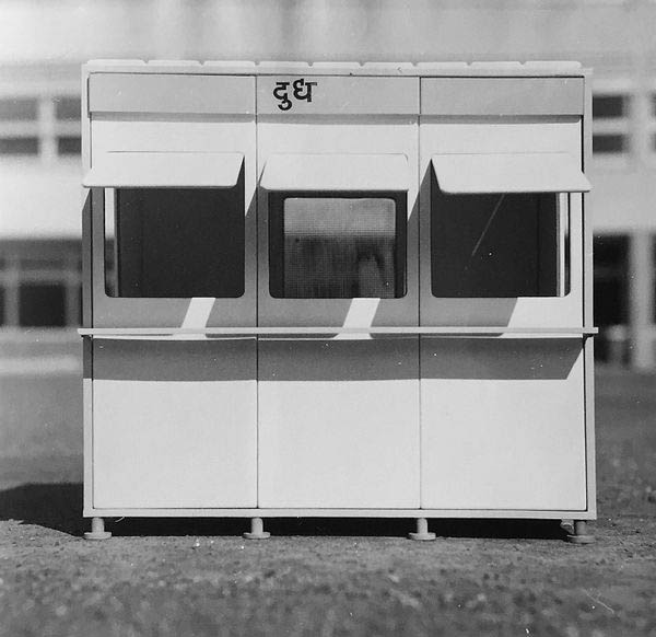
“Most of the typefaces I found from during that time were modern sans serif typefaces but had irregular hand drawn features to all of them. The other example that had similar hand-drawn irregular features was the type on Dayanita Singh’s File Room images on these old document books,” Ramesh said.

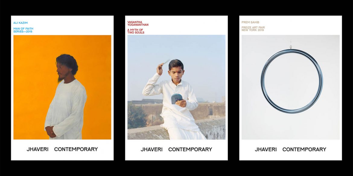
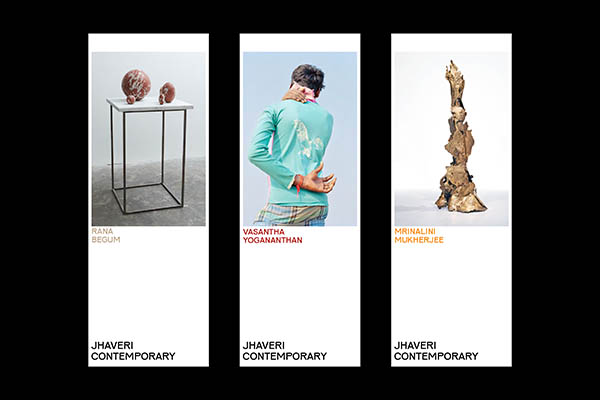
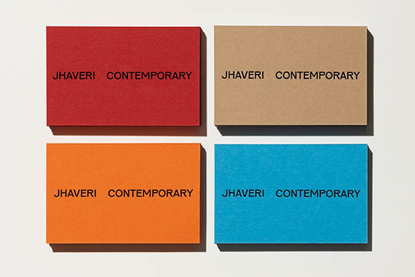
The new wordmark for Jhaveri Contemporary takes inspiration from these post-independence hand-drawn types that have their own quirks and irregularities. “I found the wordmark which is exactly what I wanted with it’s nice irregularities, yet has a monoline structure, which reminded me of the type I saw on the Milk Kiosk image,” she said. The palette on the other hand is inspired by gallery’s interiors. The word mark is created using a typeface Pirelli — which with its irregularities, yet monoline structure reminded Ramesh of the Milk Kiosk type — designed by Karel Martens and Jungmyung Lee.
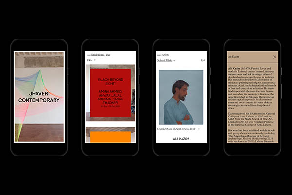
The identity redesign was a year-long project stretching over 2020, a year when the whole world was desperately trying to deal with the covid-19 pandemic. And so, the branding also needed to adapt to the new order brought about by the pandemic. With her team, Ramesh created a Viewing Room for interesting online exhibitions with video features. “Given the new pandemic situation, we also added an in-room viewing feature for artworks using their gallery space as backdrop, which looks quite cool. It is launching next month which we are thrilled about,” Ramesh says.
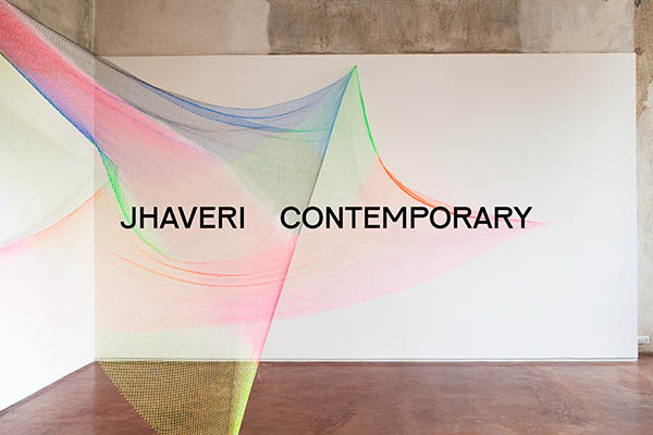
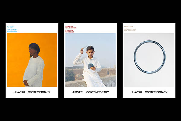
Here is the new branding for Jhaveri Contemporary:
***